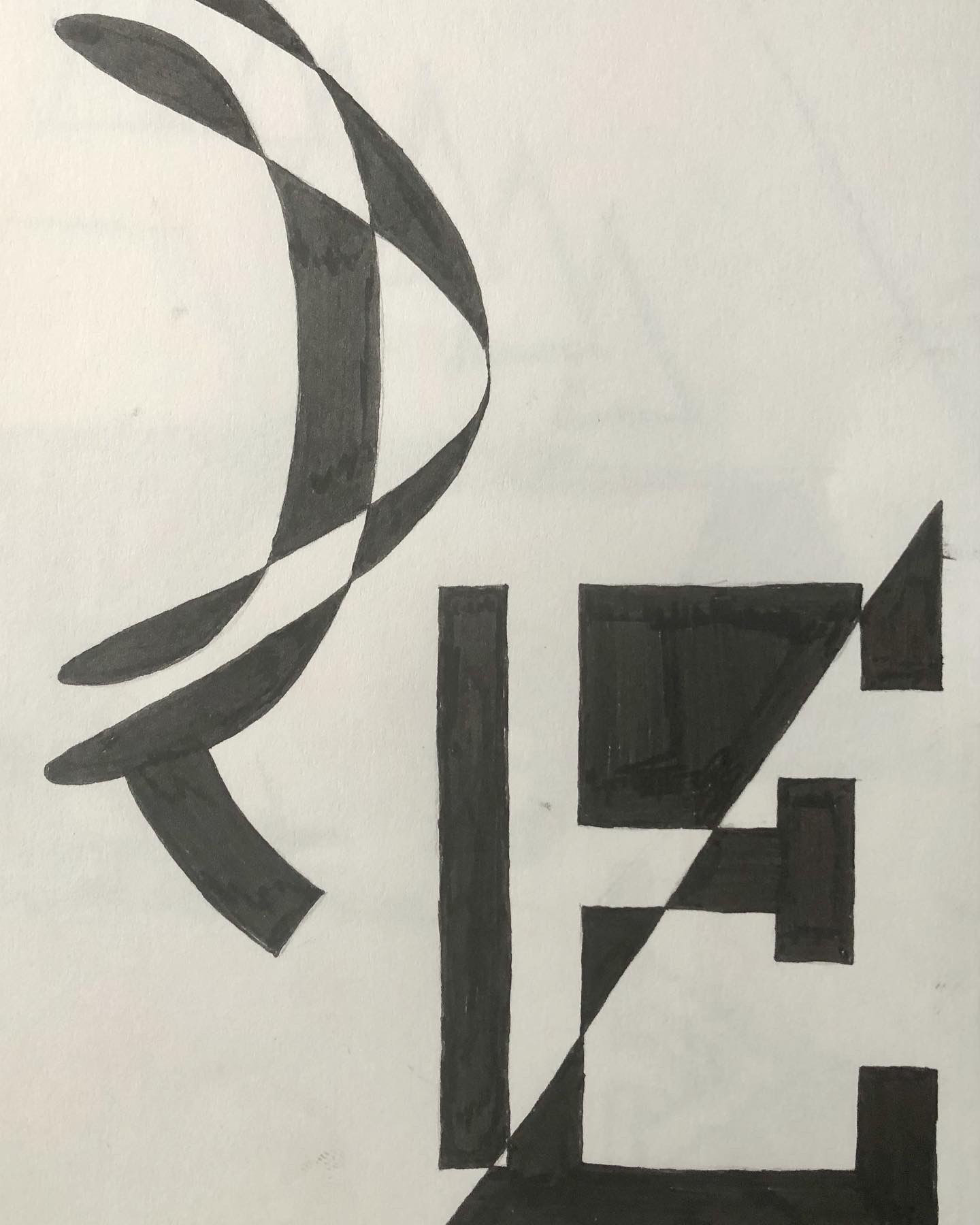
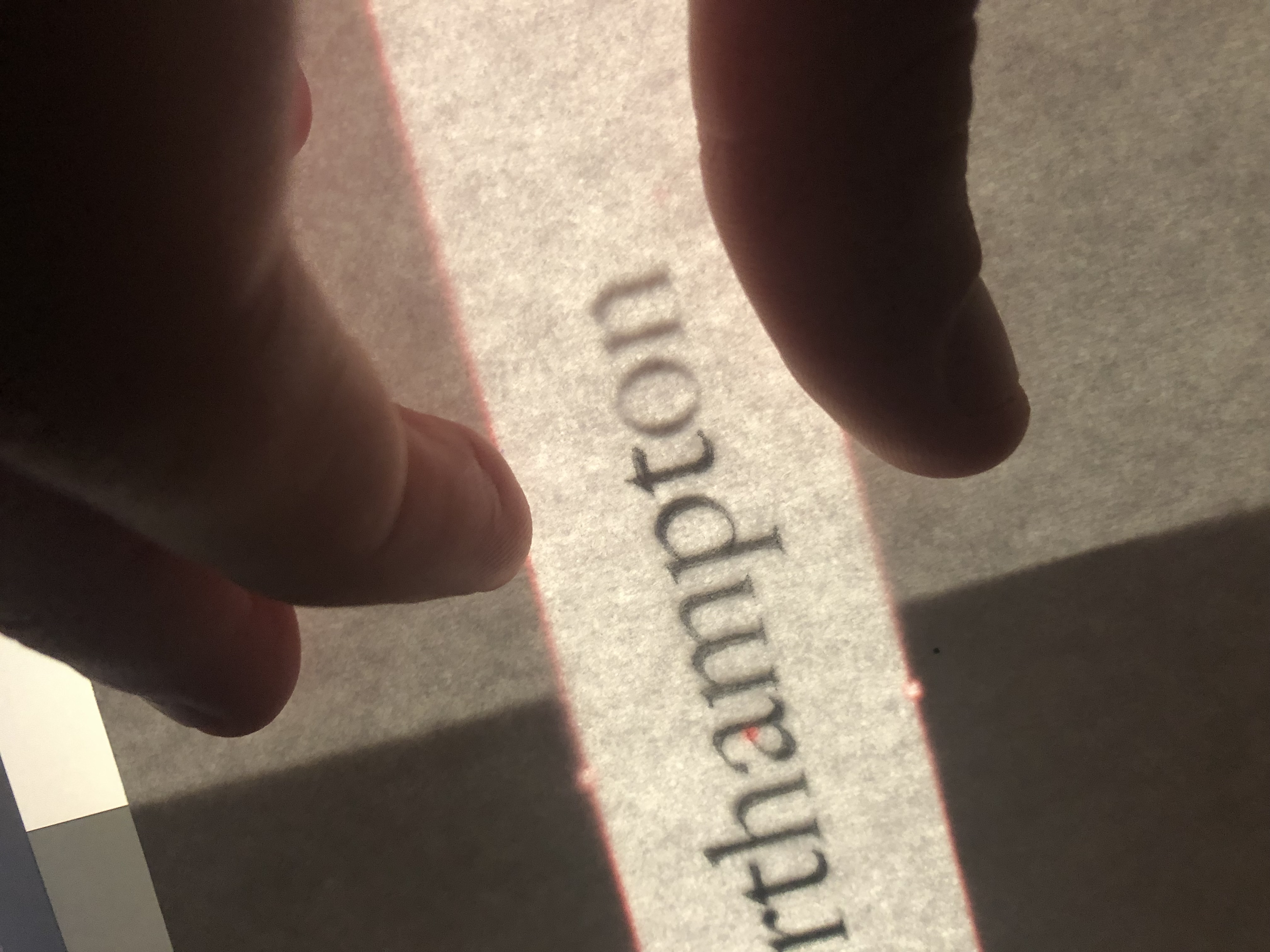
Sketching for the Loyal project began in 2021. Before moving to software, it became essential to gain an intimate understanding of letterforms through tracing, comparing, and playing.
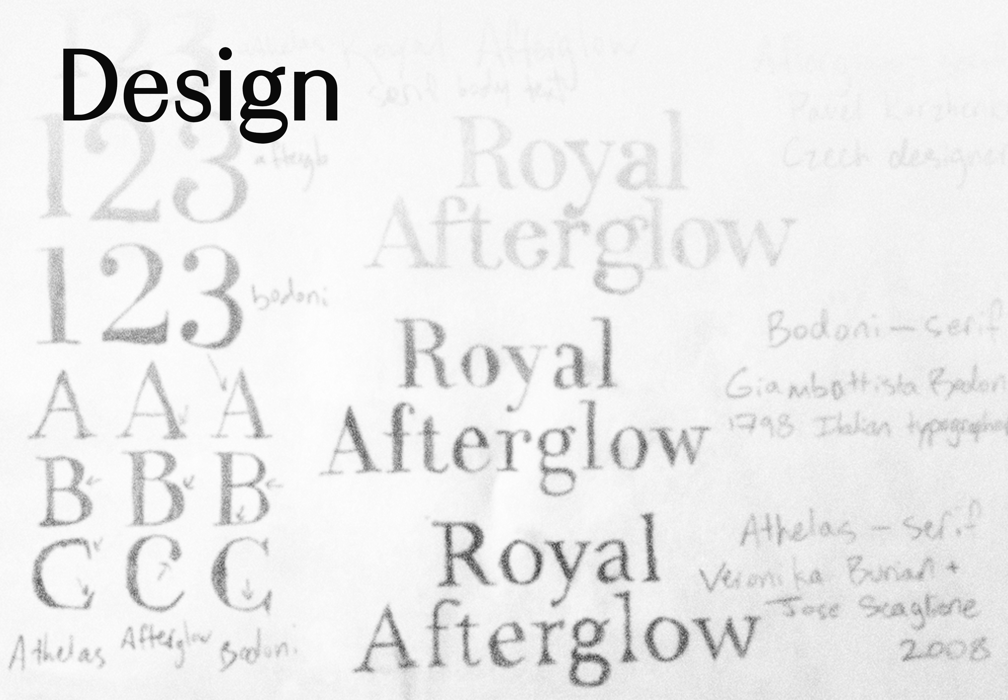

Sketching for the Loyal project began in 2021. Before moving to software, it became essential to gain an intimate understanding of letterforms through tracing, comparing, and playing.
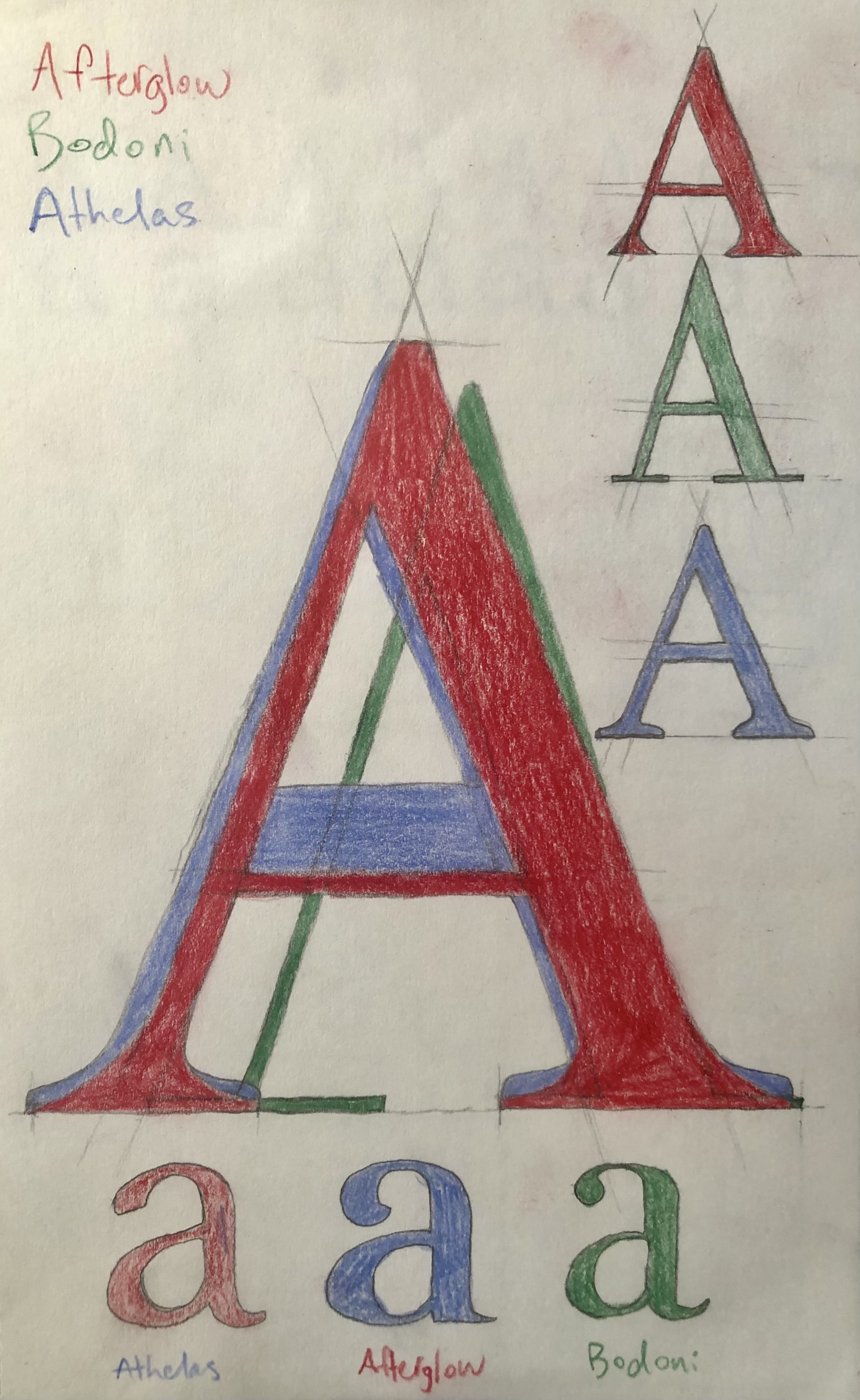
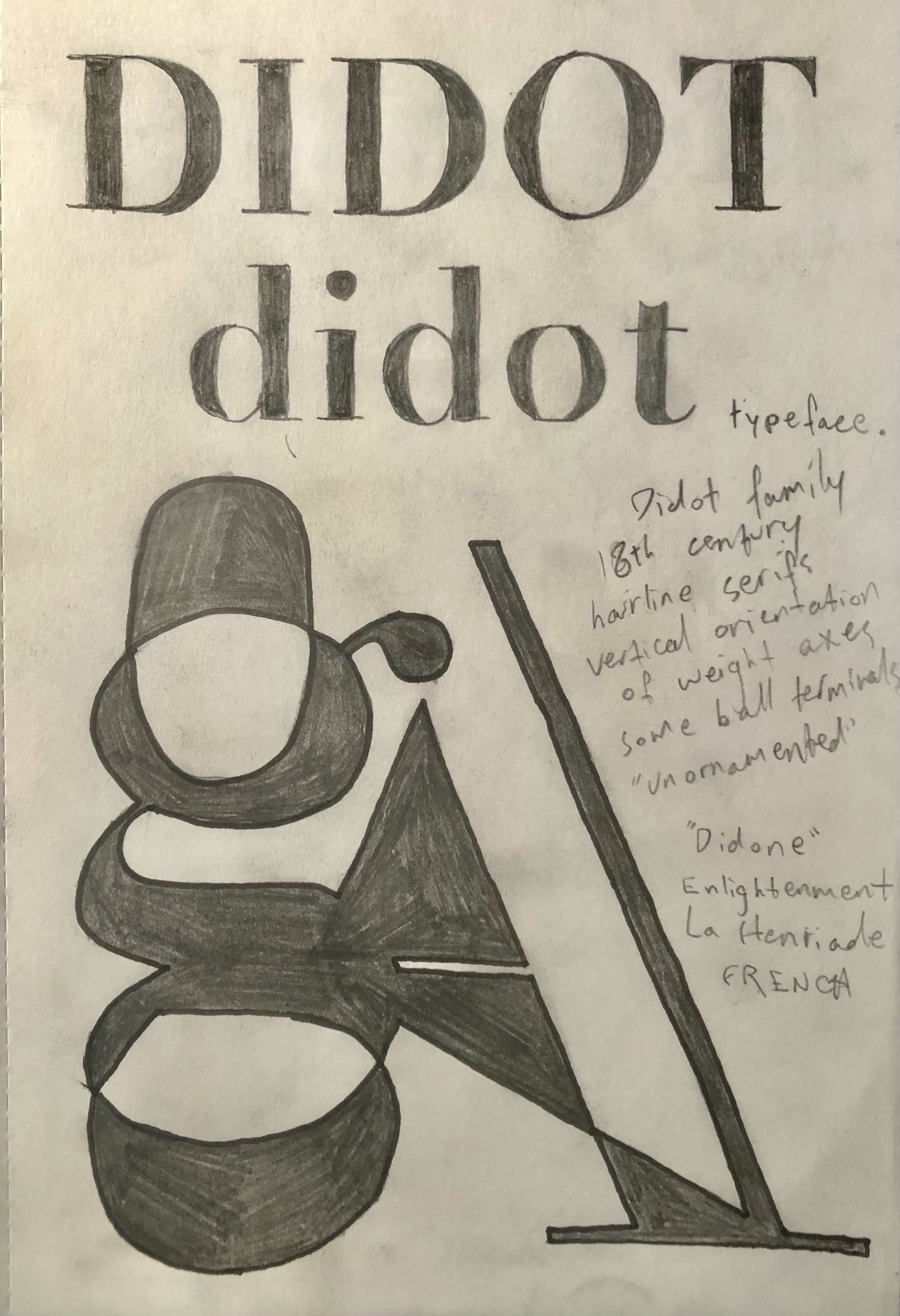
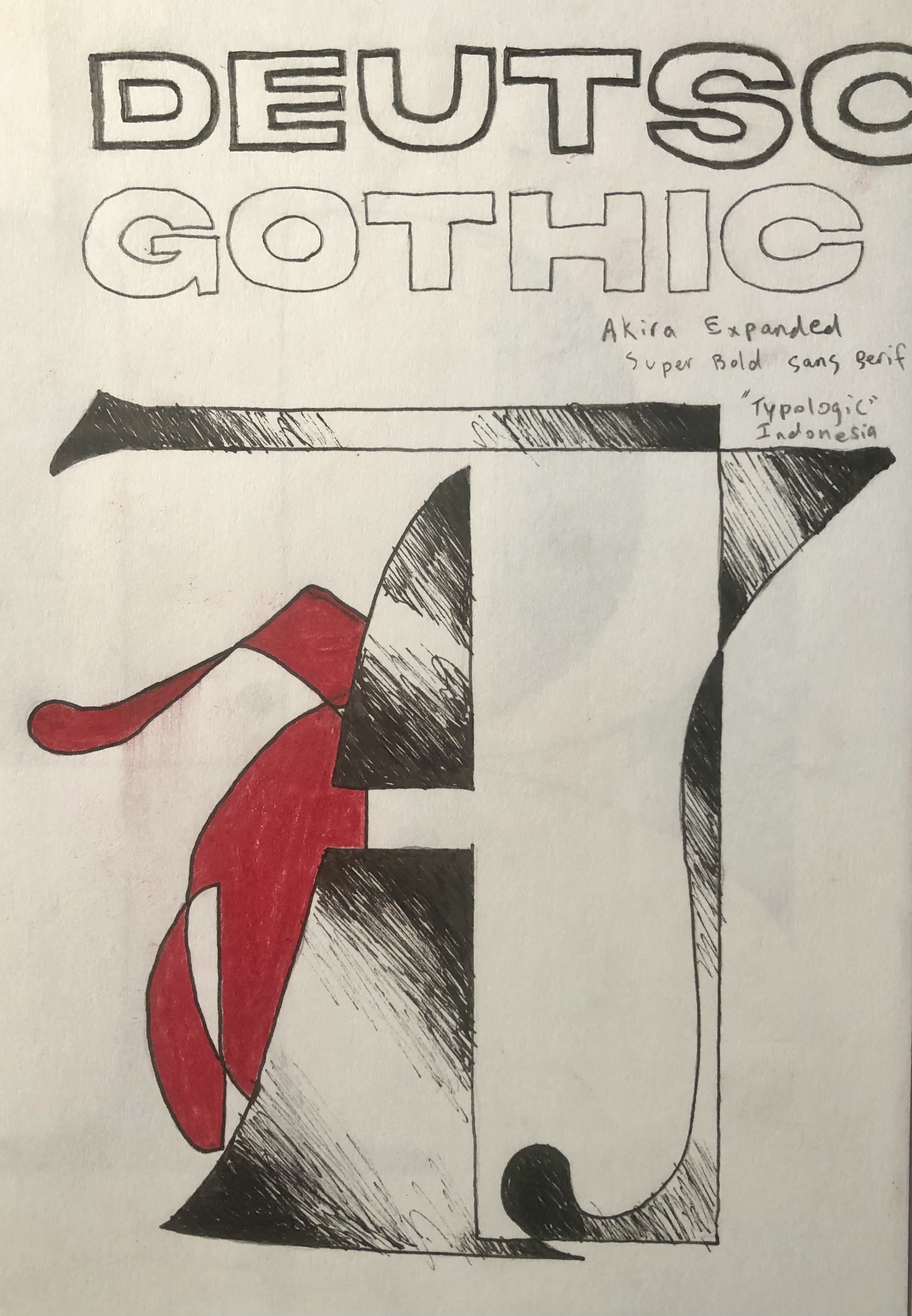
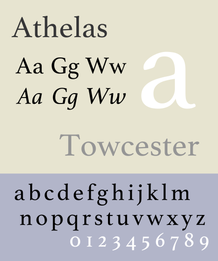
I decided to focus on three reference typefaces: Athelas, a serif body face designed by Veronika Burian and Jose Scaglione and released in 2008 (type-together.com/athelas), Bodoni, a versatile Modern serif originally designed by Giambattista Bodoni in the late 1700s, and Afterglow, a decorative display face designed by Pavel Korzhenko in 2018 (myfonts.com/afterglow).
The aim of Loyal was to combine the unique elements of these three very different styles of type into a robust family of fonts capable of effective display and body.


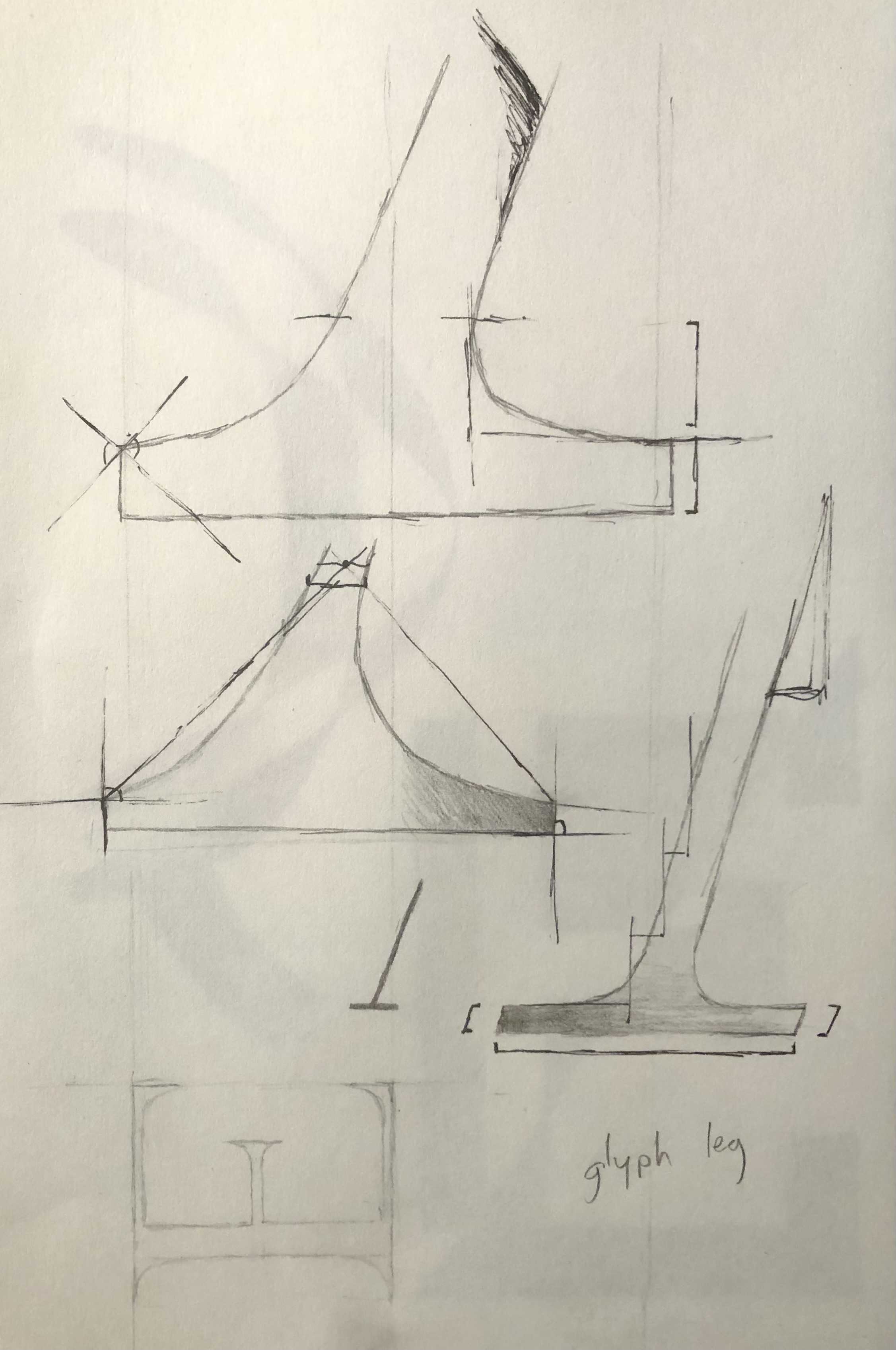
Perhaps the longest process of design was deciding on a set of definitve tools with which to build the glyphs; these would be the benchmarks against which every character would be measured and modified. They needed to be flexible and adaptable.
This also calls into to question: what is the tool of the type? This would not be answered fully until after development.
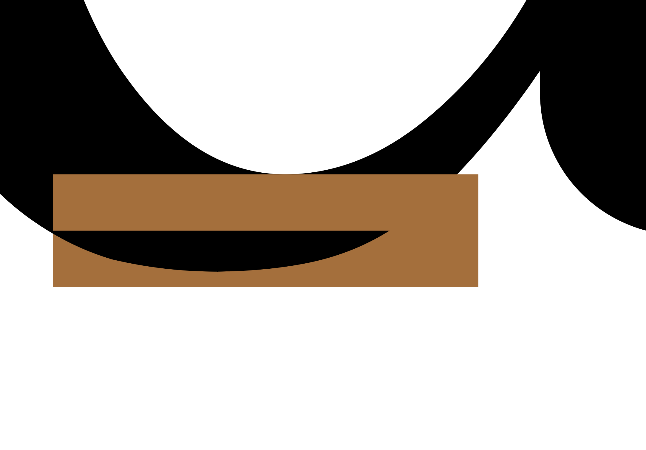

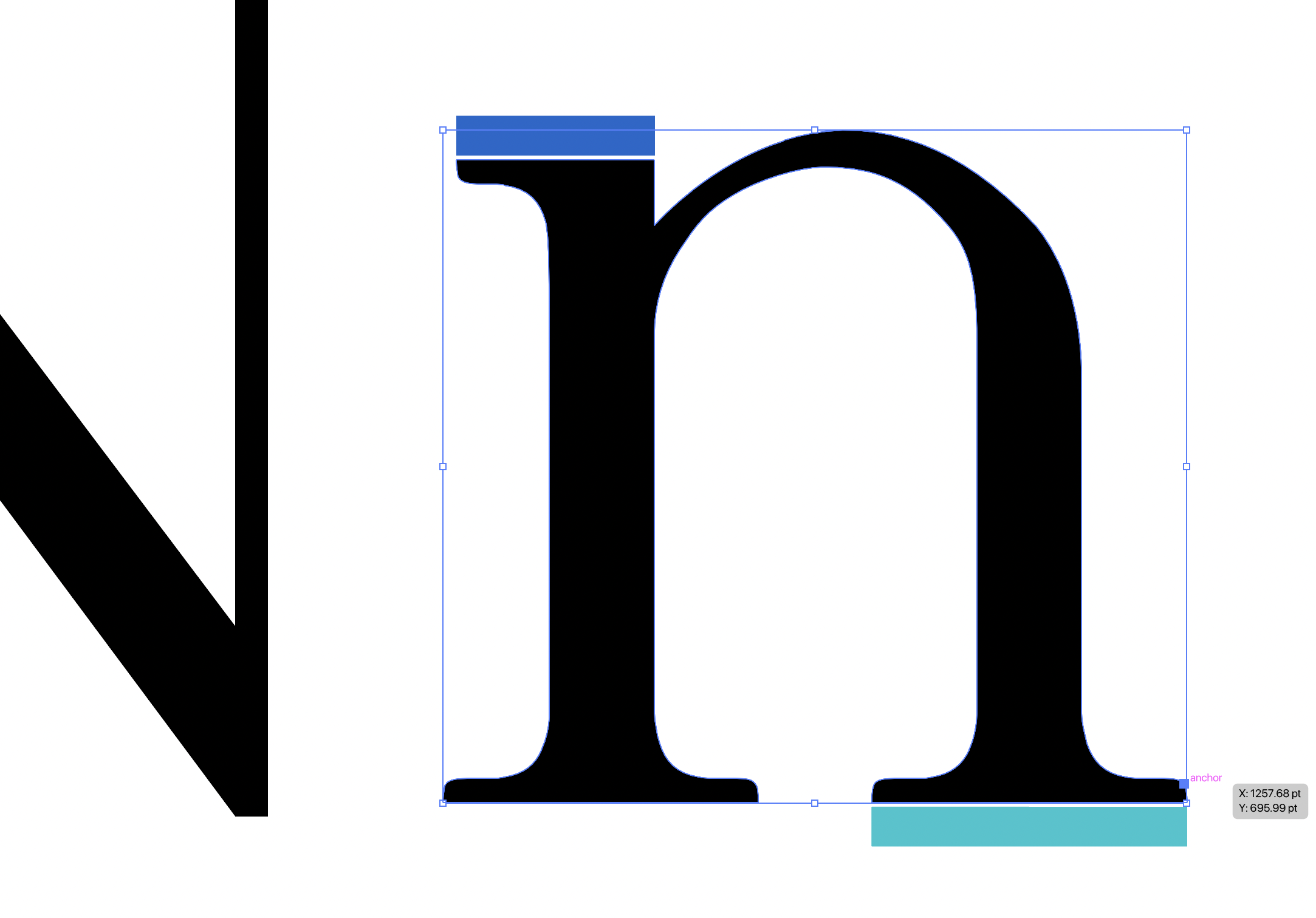


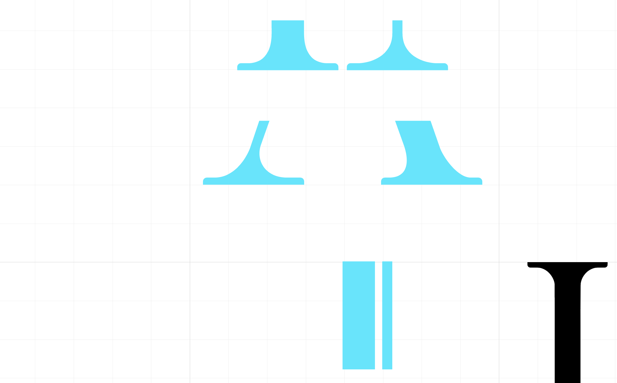
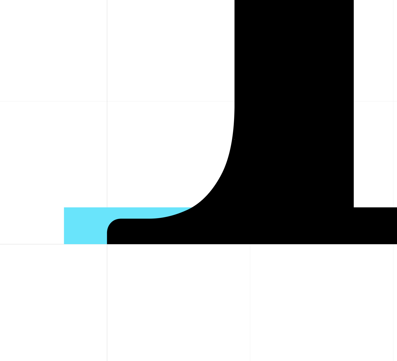
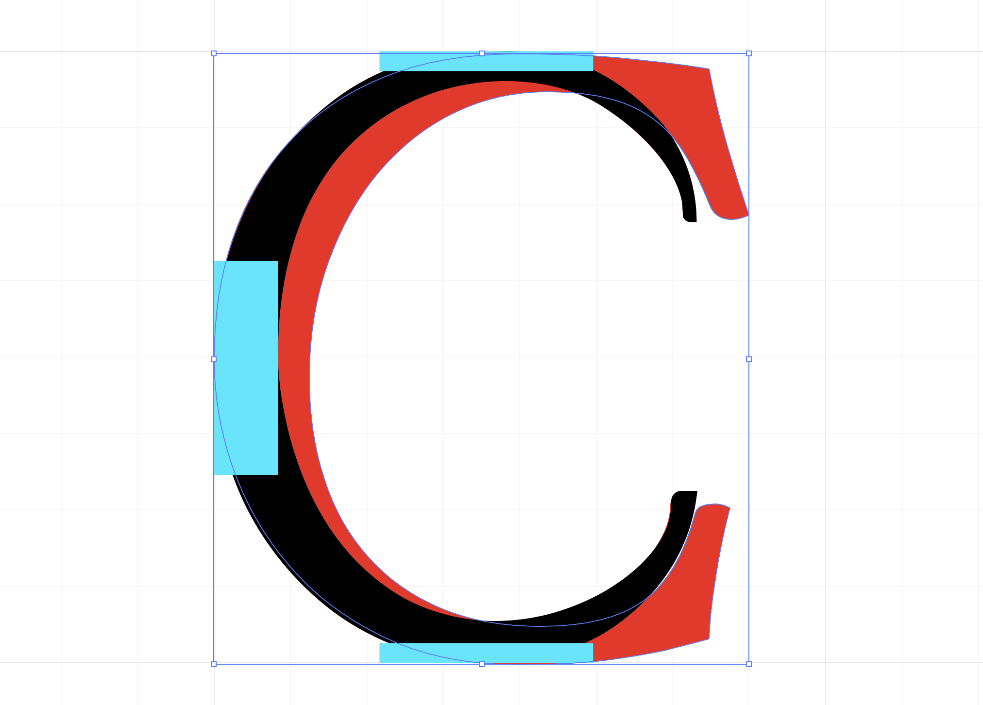
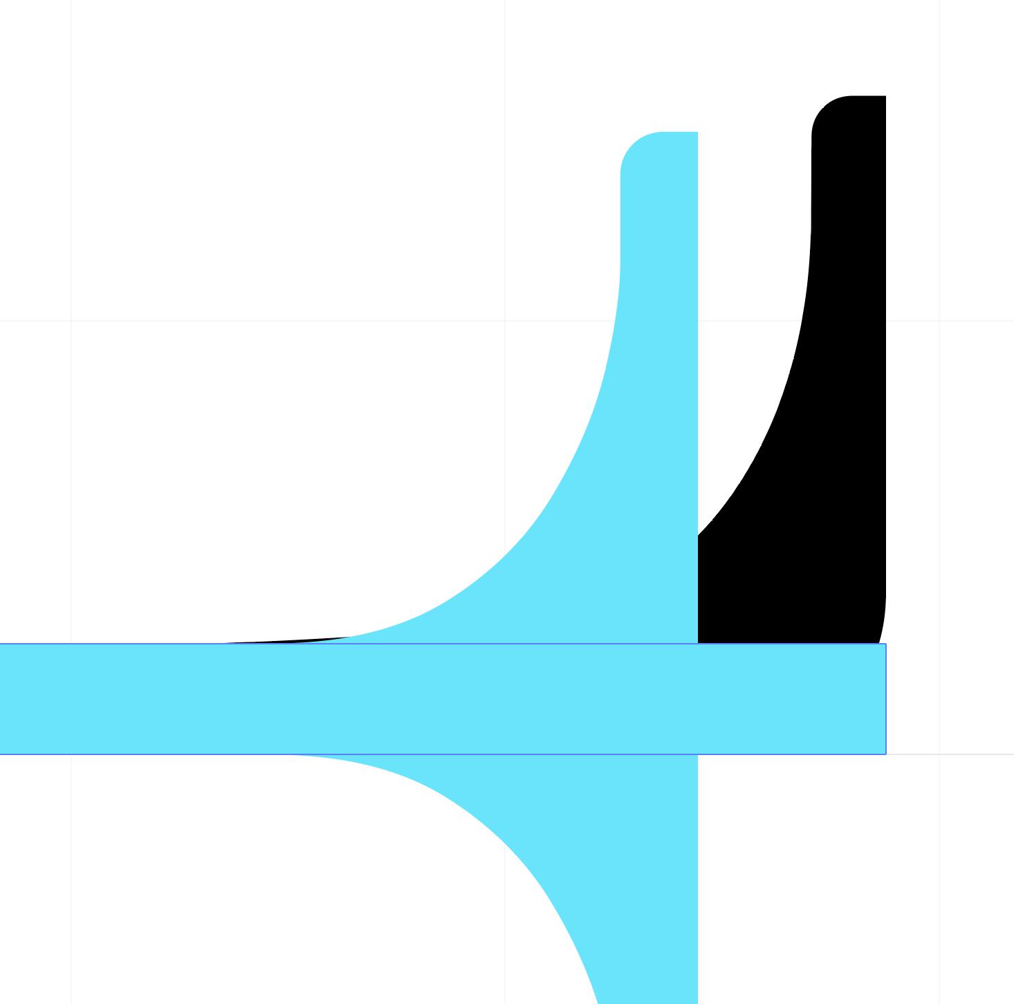
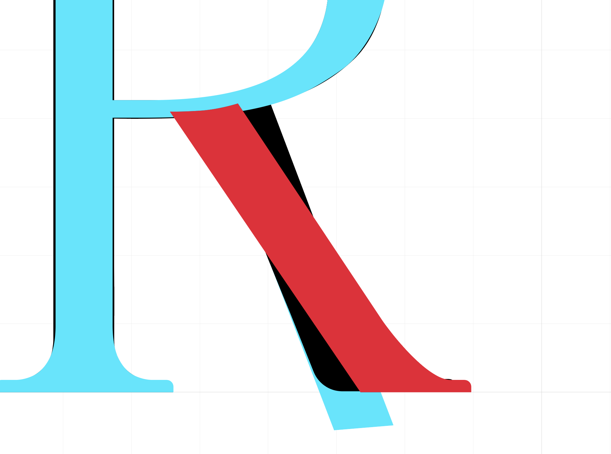
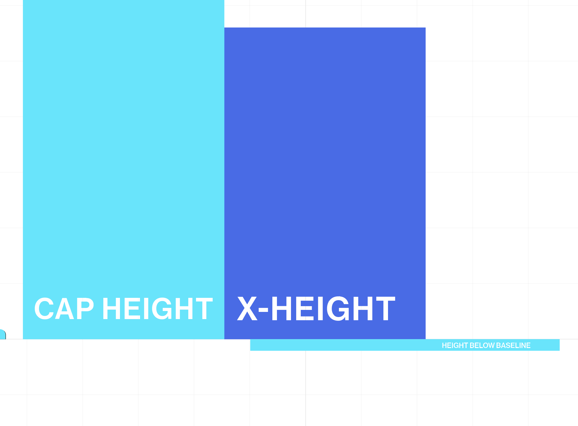

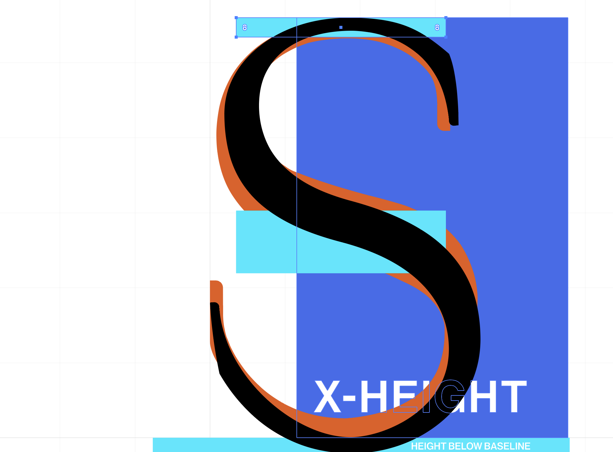
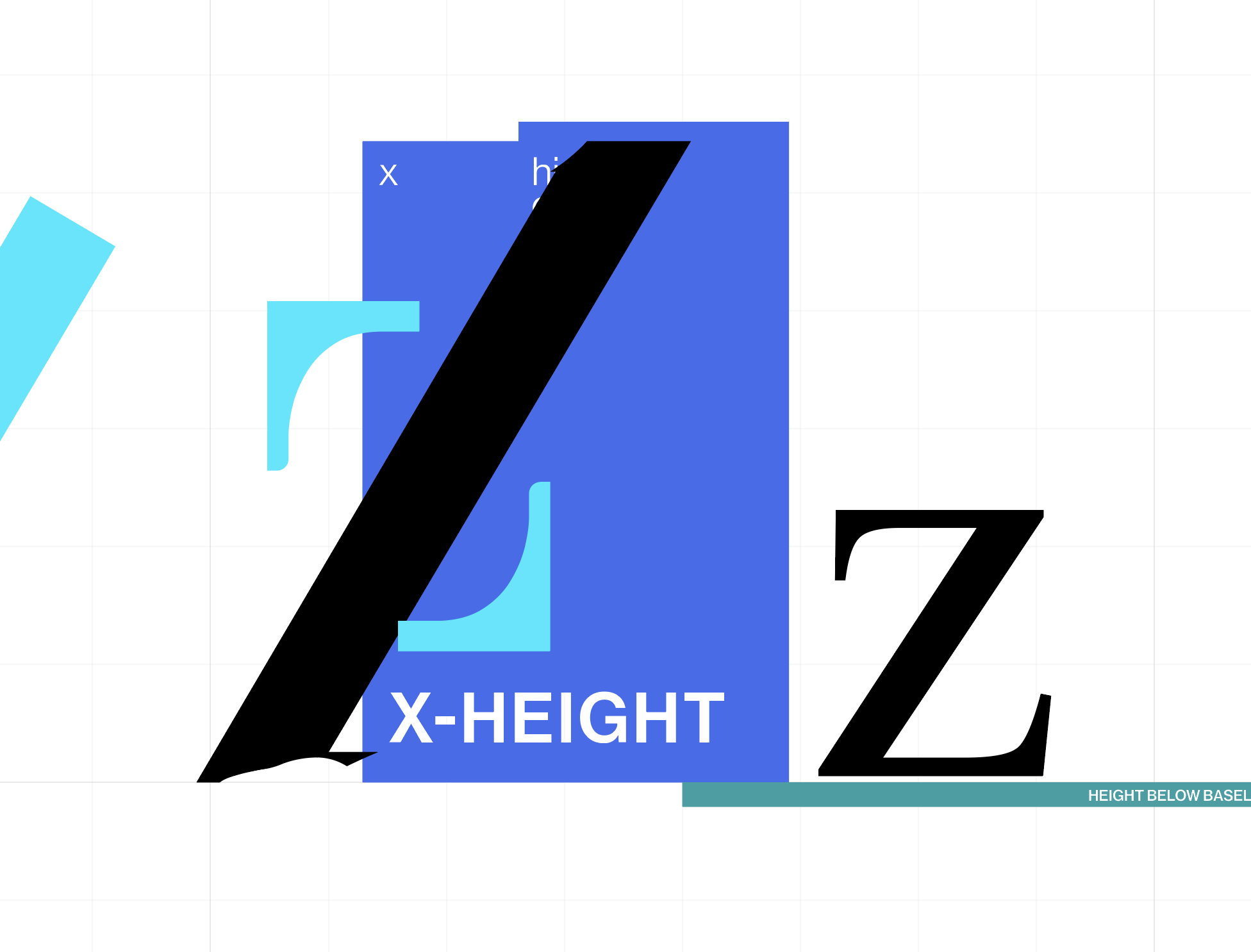
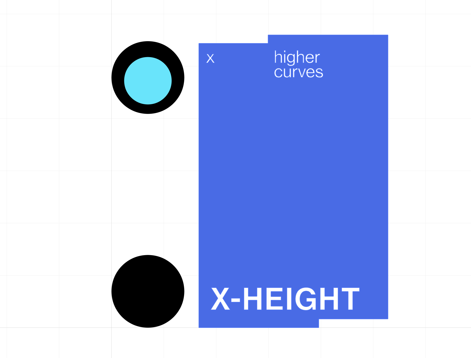

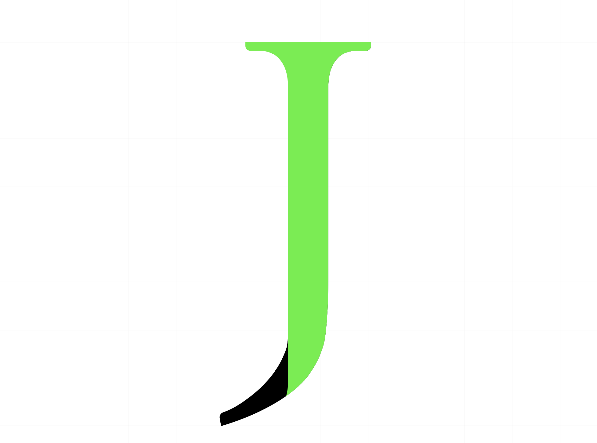
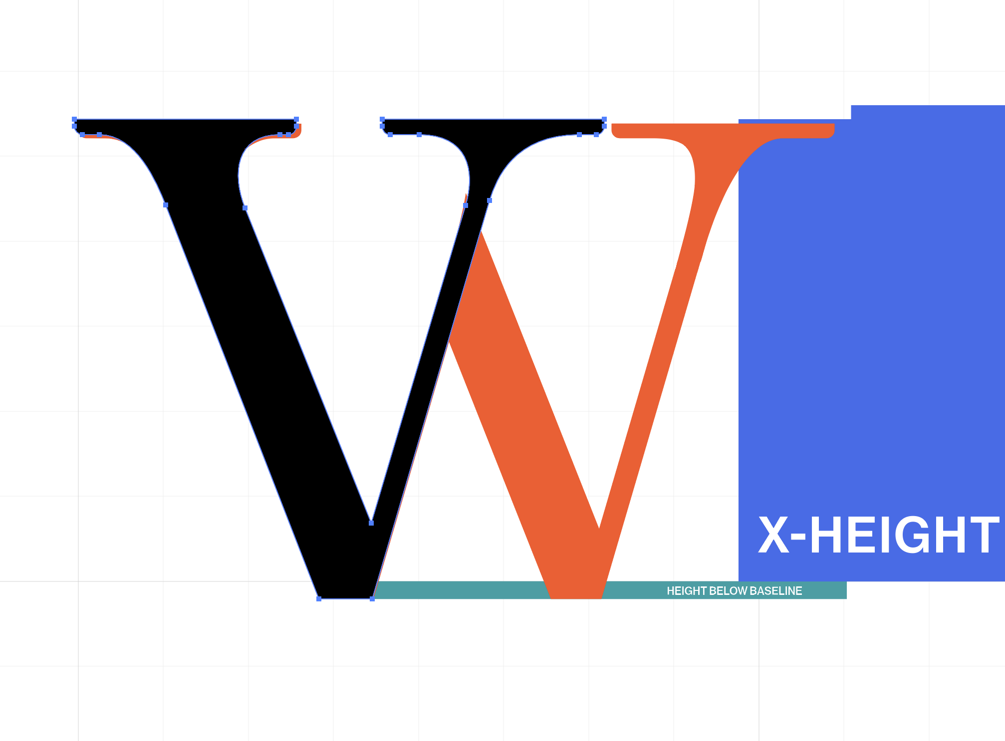
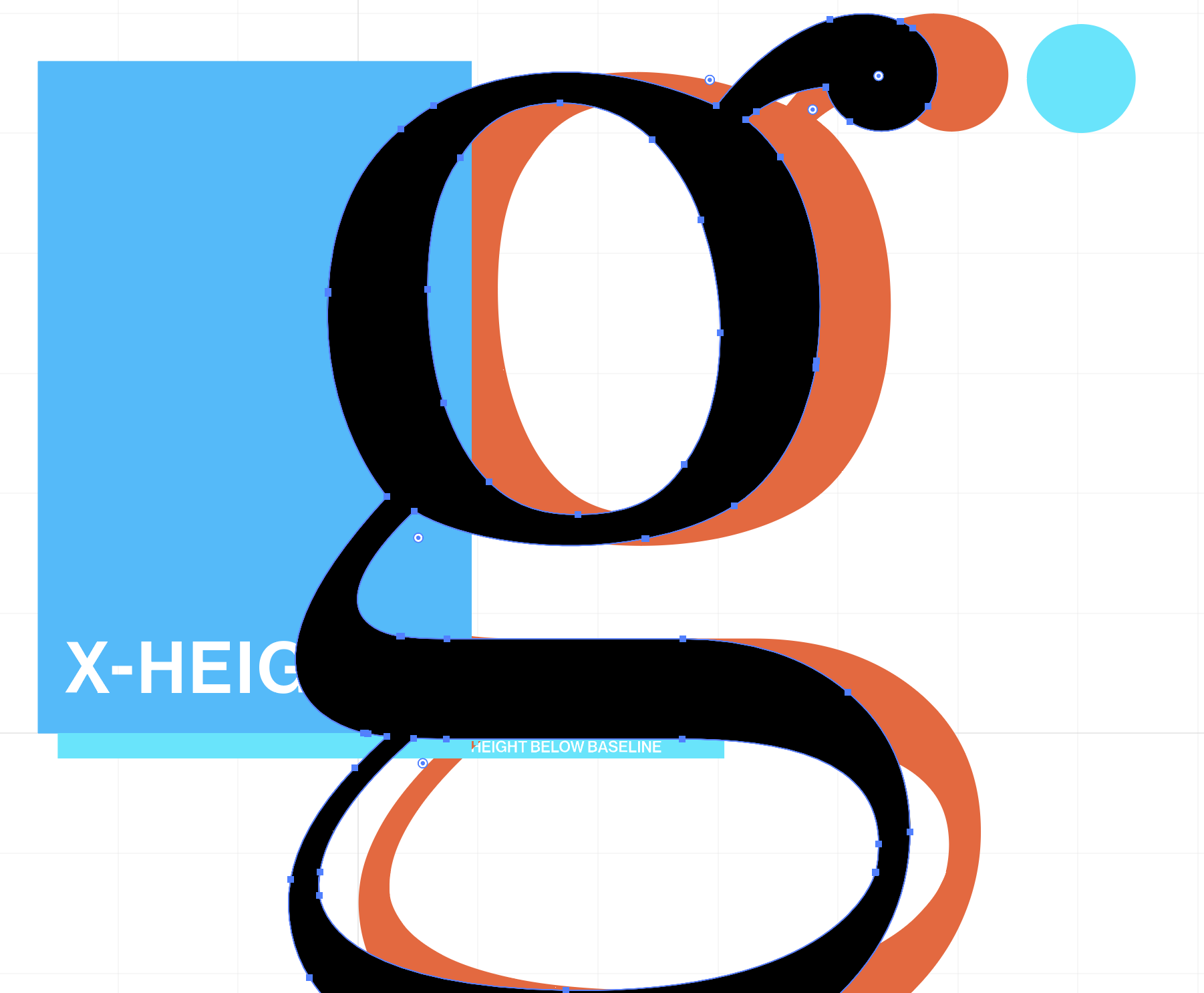

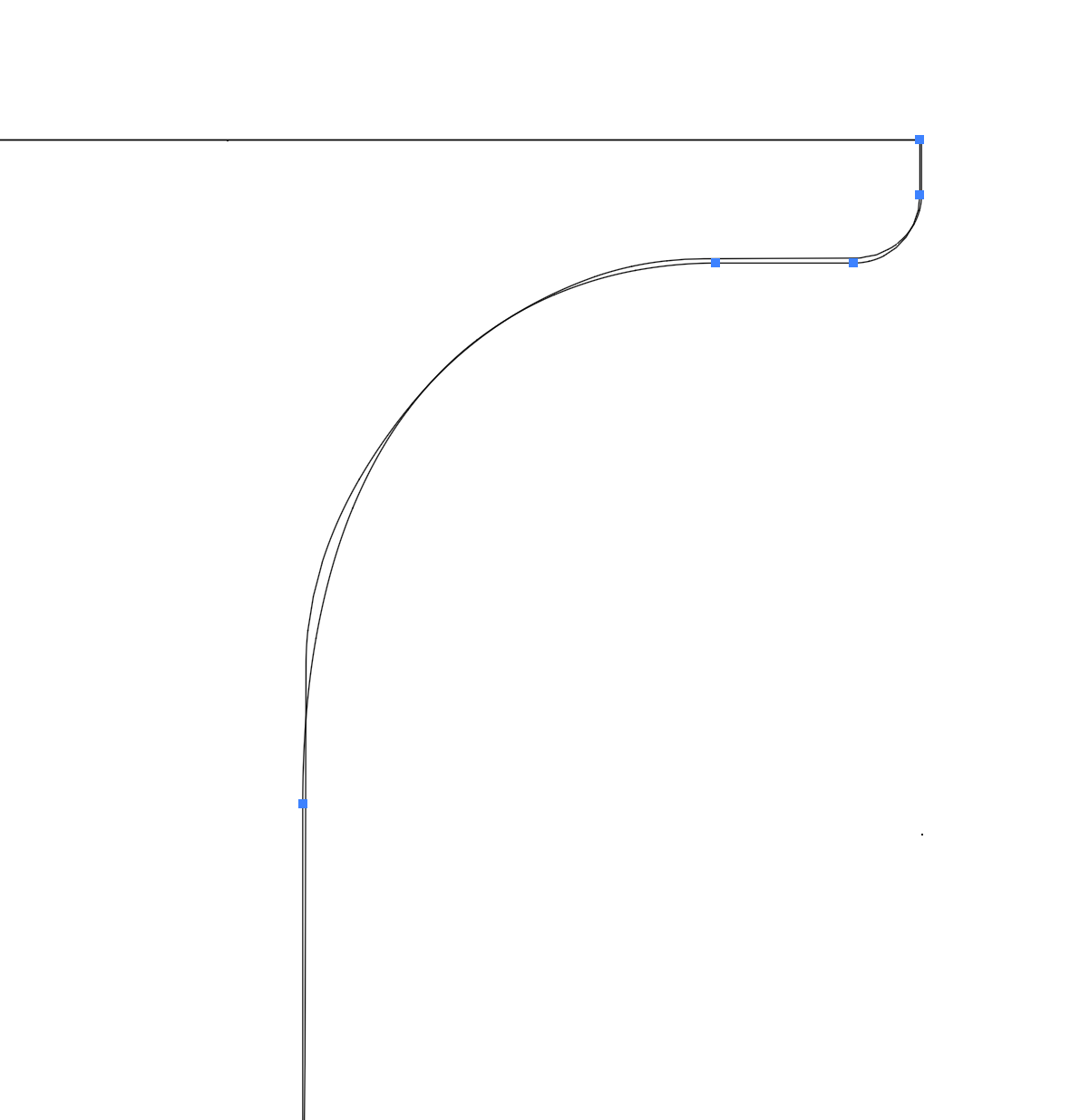
High color contrast—i.e. cyan, pink, or orange on black and white—became an invaluable tool in comparing and resolving subtleties between glyphs; as you can see below, derelict curves and points can get confused very quickly.


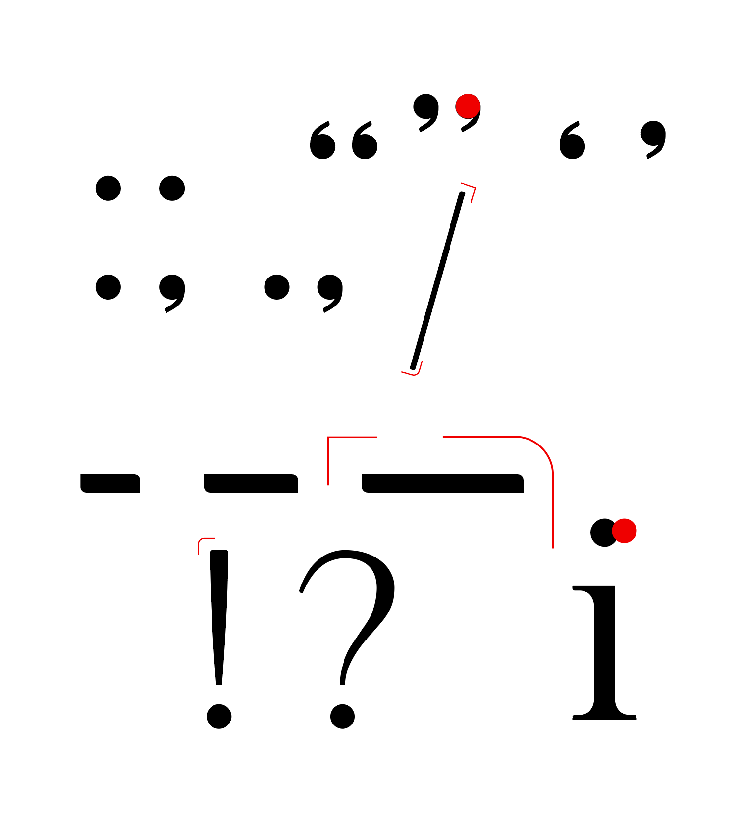
In order to have a complete set to work with for development, I needed to move toward completing a cohesive set of majuscules (capital letters), miniscules (lowercase letters), punctuation, and all of that for sans-serif as well.
For many glyphs, this was as easy as chopping off serifs and adjusting some stroke contrast. For letters with terminals and more curves like G, J, S, a, c, and f, more decisions needed to be made about how the glyphs were going to look and function.

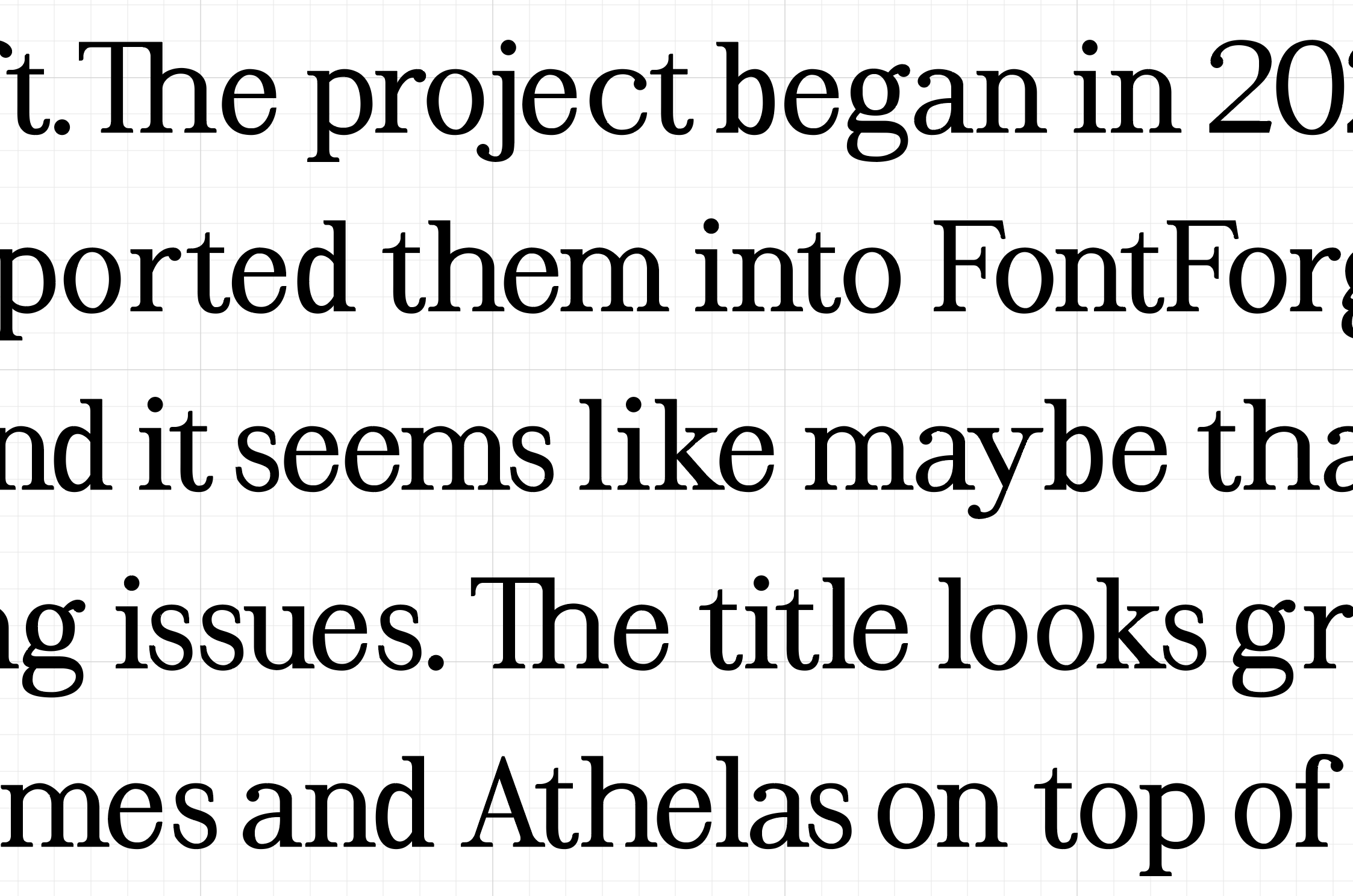
There is something about designing glyphs in the late stages that can only progress when viewing them in real words and paragraphs. An isolated glyph or an ordered alphabet only takes you so far—giving context and ‘meaning’ to the letters makes visible all the hidden discrepencies.
This meant manually kerning each glyph-shape and making sure they all laid on the same baseline. After development this process could speed up exponentially, followed by many more iterations and revisions.
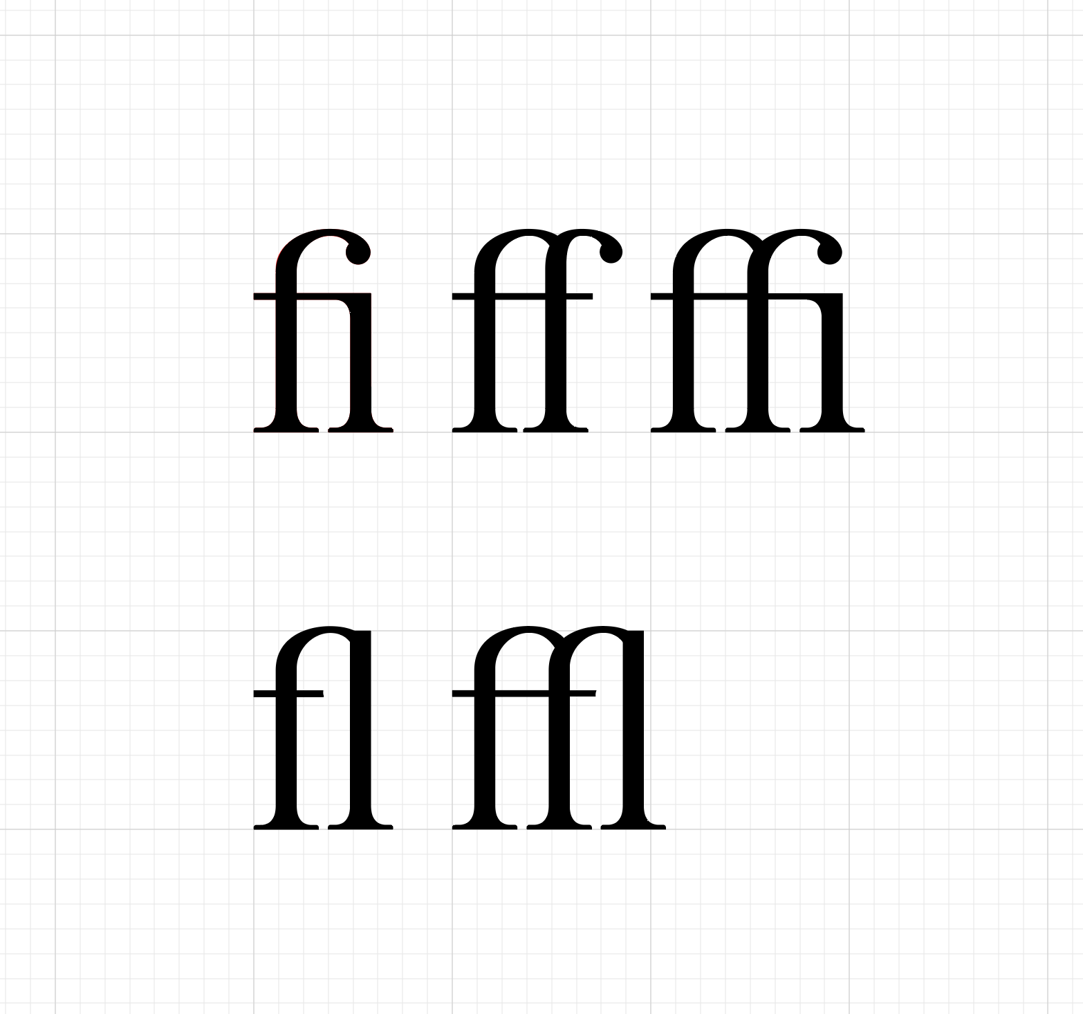
This also made me realize the need for ligatures (a glyph made of two joined letters). The standard ligatures of fi, ff, ffi, fl, and ffl were non-negotiable, but there are also many more stylistic ligatures to choose from. These arose from a historically practical need to prevent typesetting blocks from getting damaged when the hood of the ‘f’ bumped into raised letters following it. Fun fact: the ampersand (&) arose from a ligature for e and t, from the Latin “et,” meaning “and.”


A completed first draft meant it was time to encode the glyphs, determine consistent metrics, validate the vectors, and create kerning pairs. Development >
