Files need to be prepared for each glyph separately so that the importing process is uniform and predictable. If any glyphs ride too high or too low on the baseline or any ears or tails stick out to far, it becomes apparent now.

Files need to be prepared for each glyph separately so that the importing process is uniform and predictable. If any glyphs ride too high or too low on the baseline or any ears or tails stick out to far, it becomes apparent now.
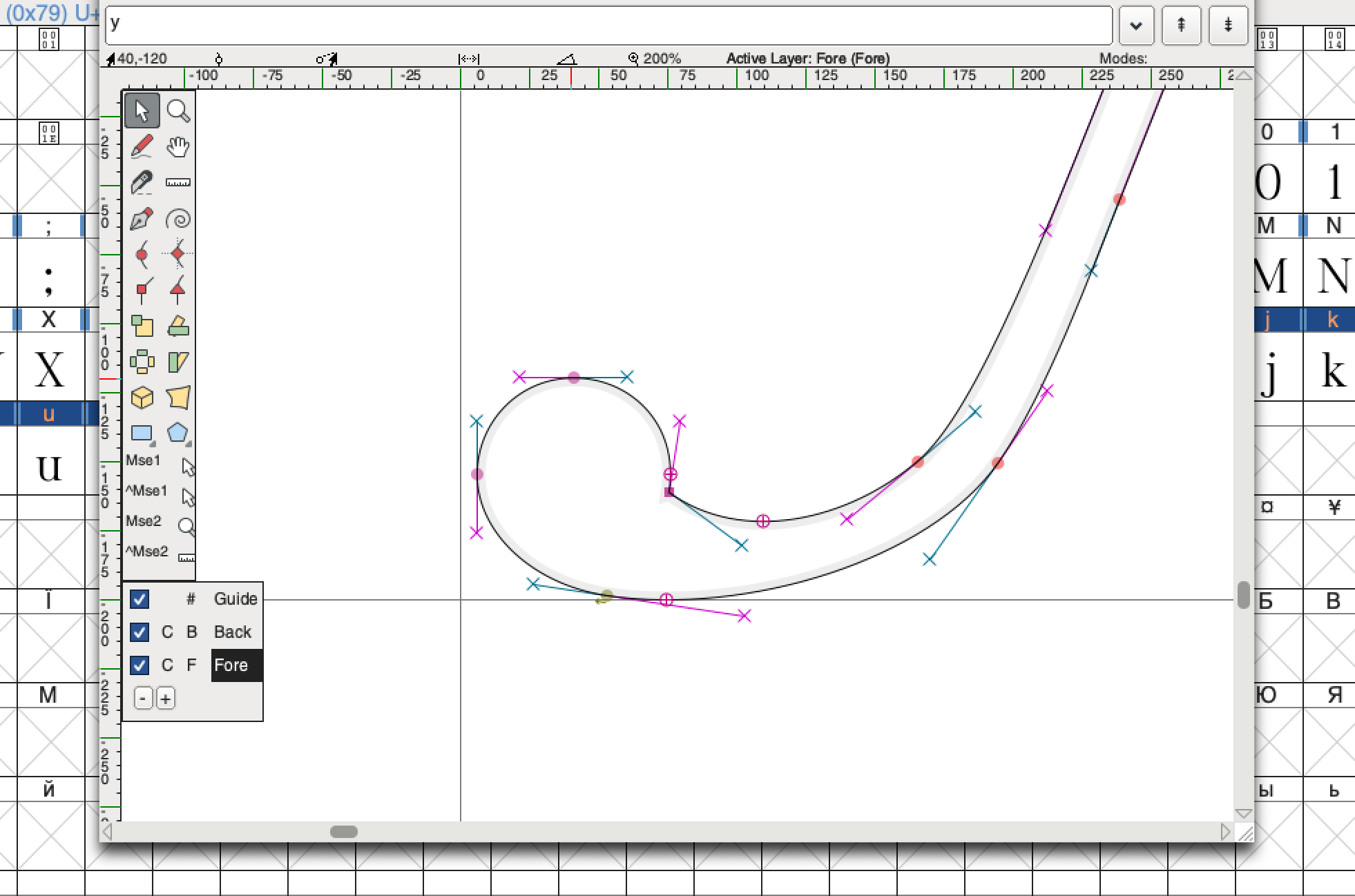
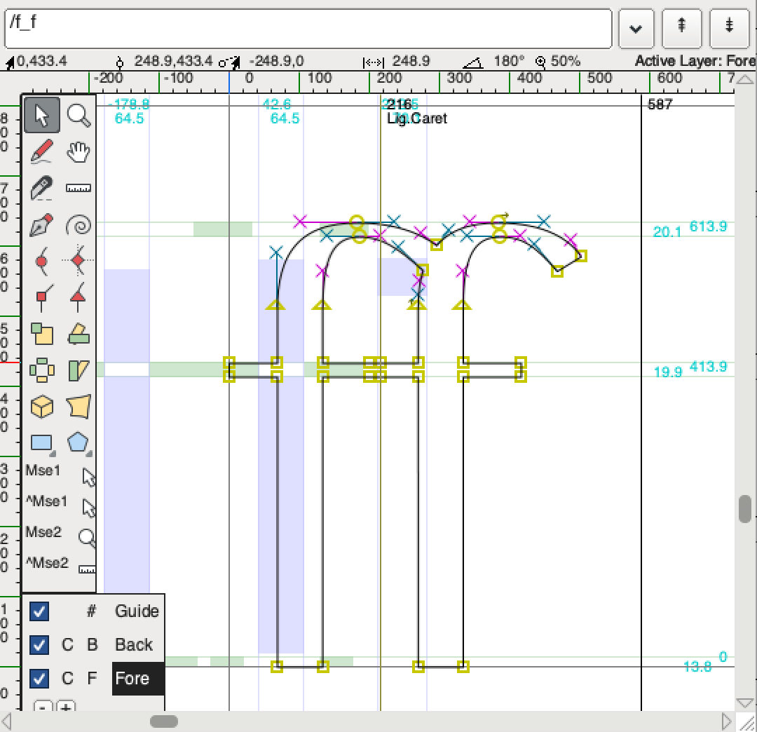
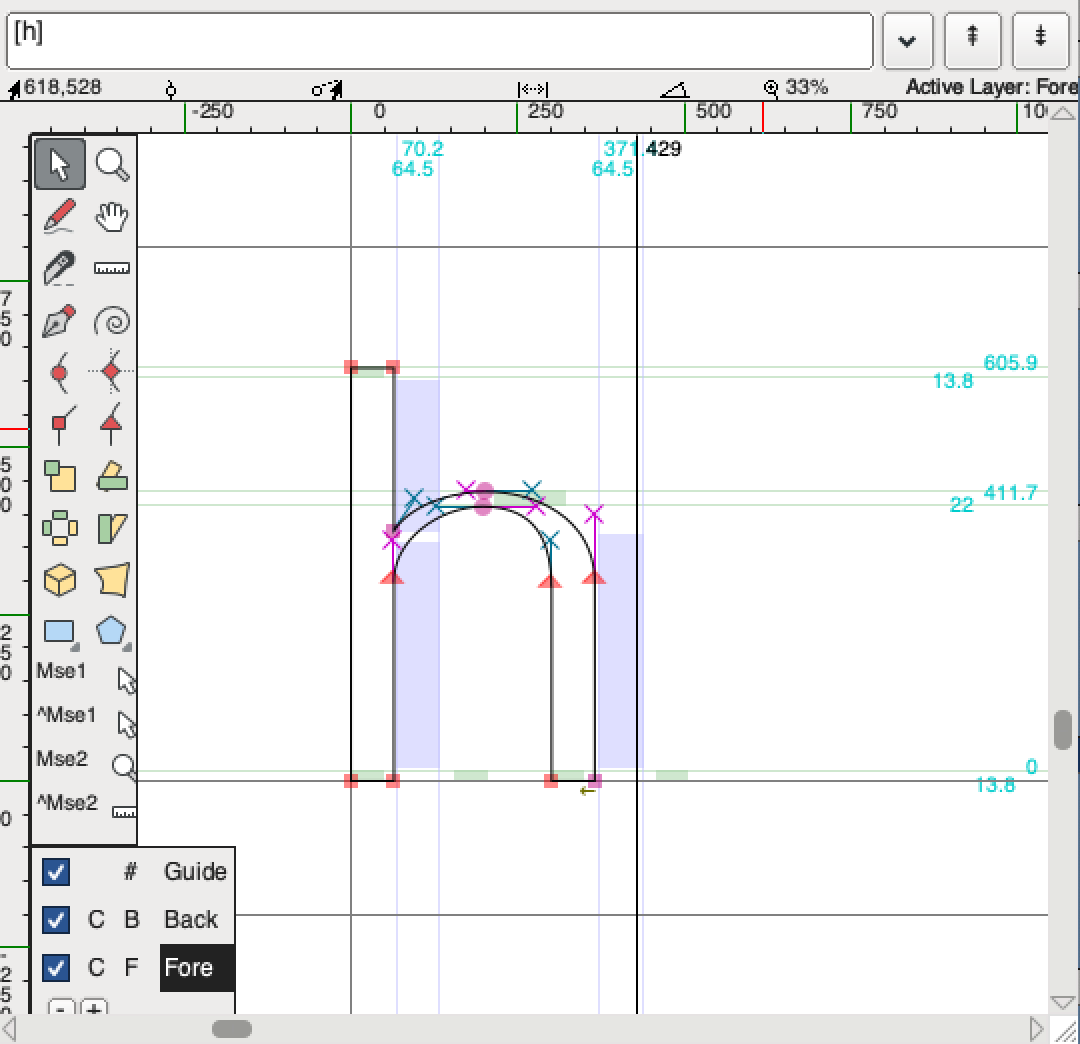
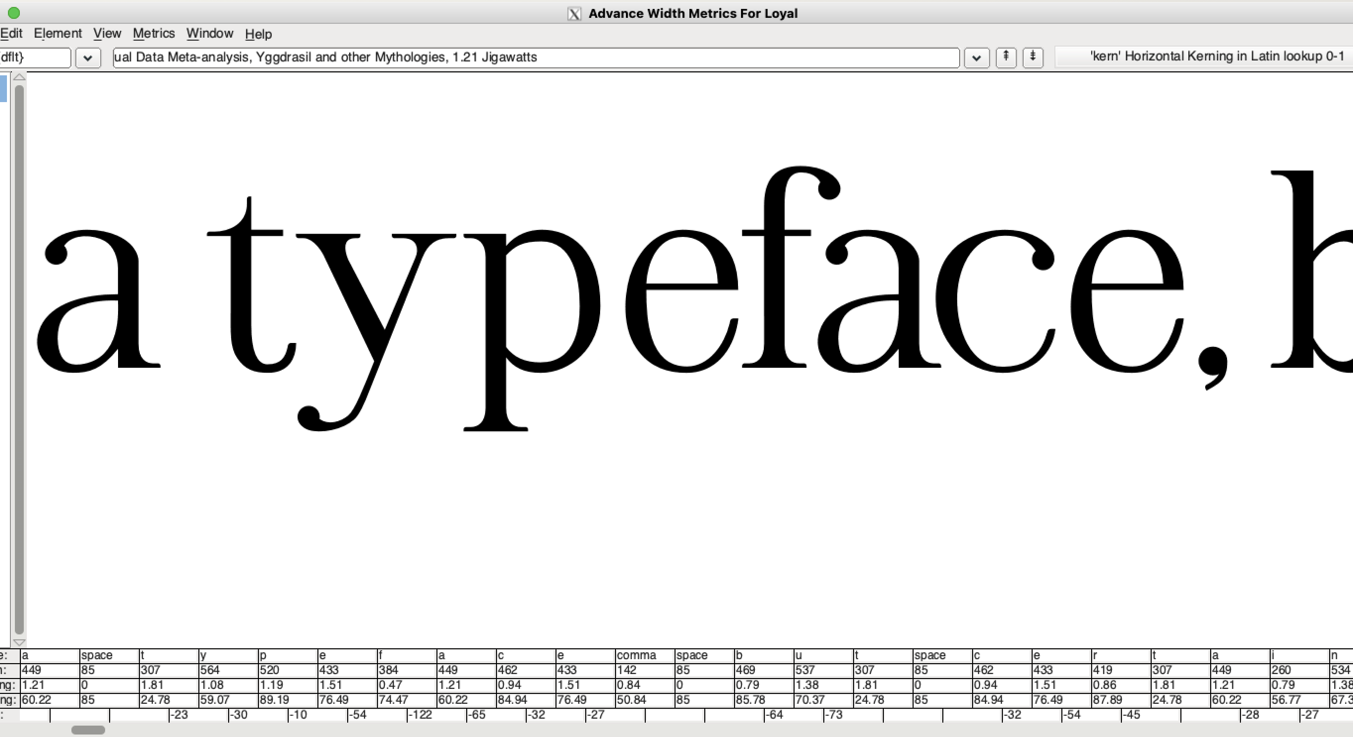
Rough approximations of letter spacing can be made for each glyph before going in after to adjust the spacing between each pair.


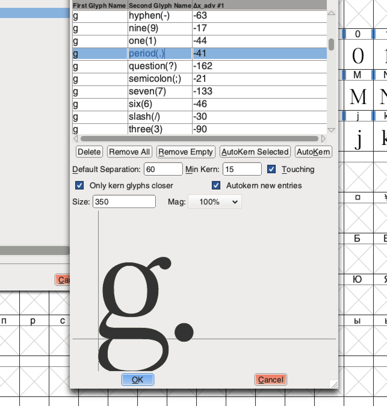
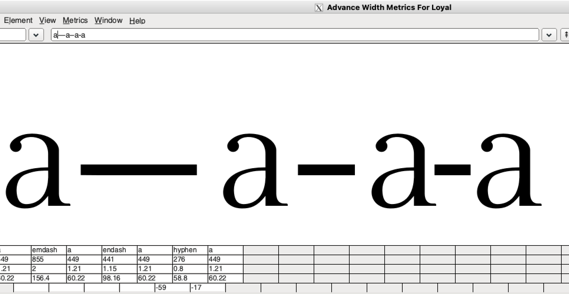
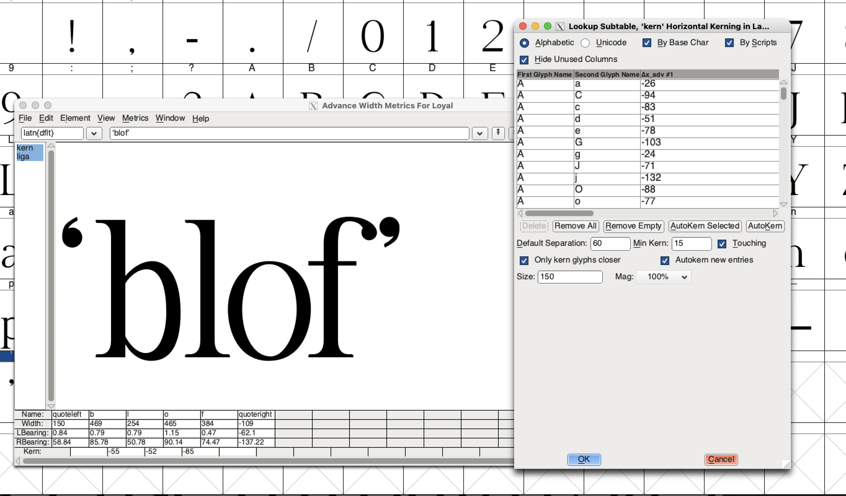
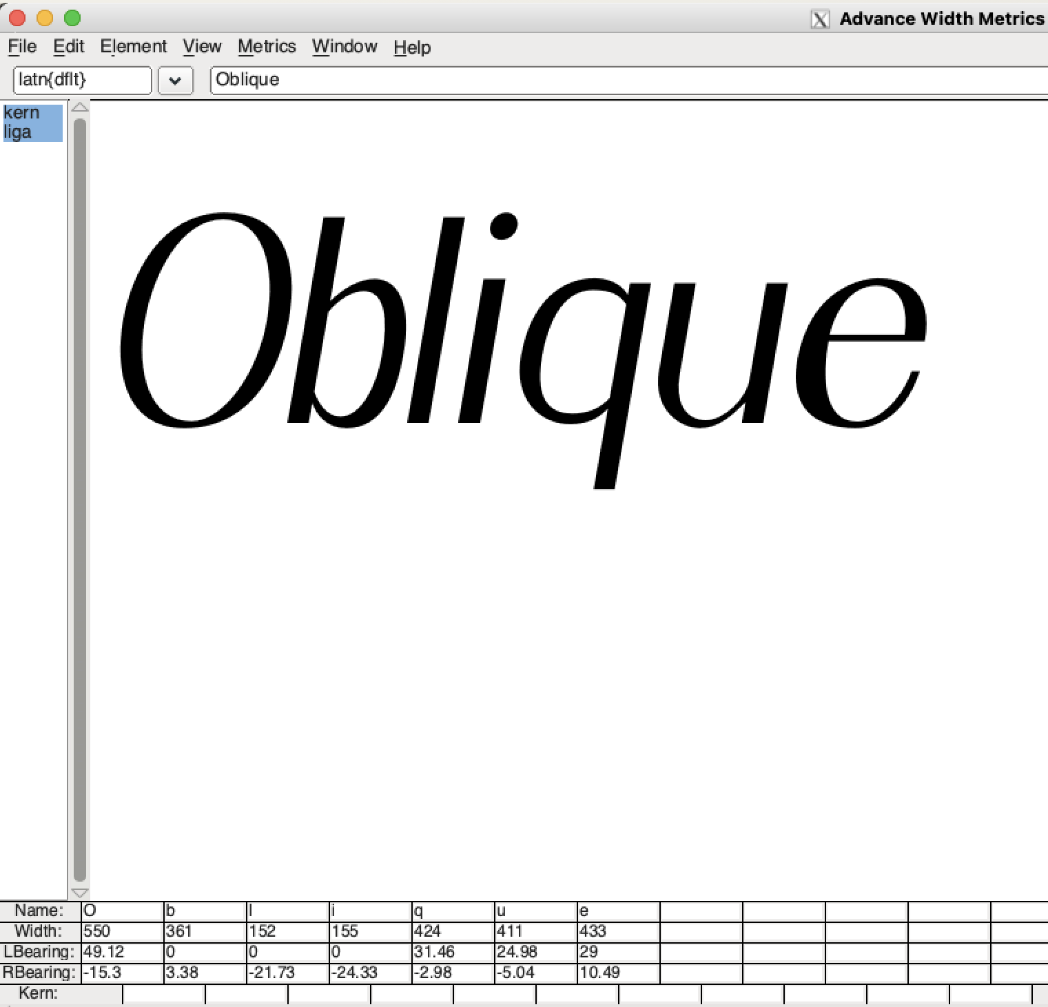
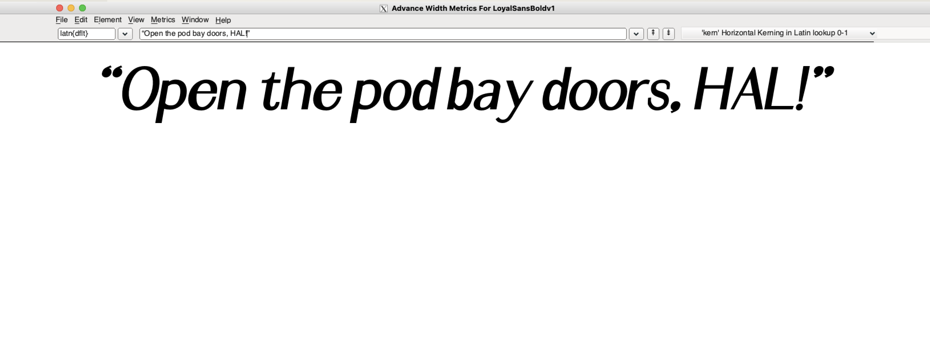
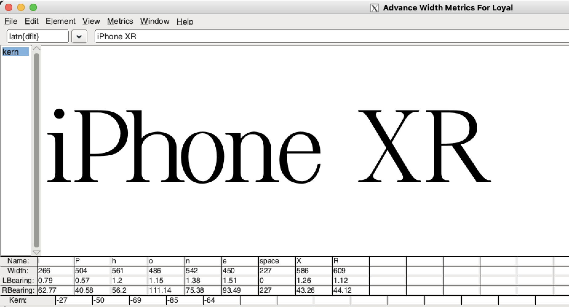
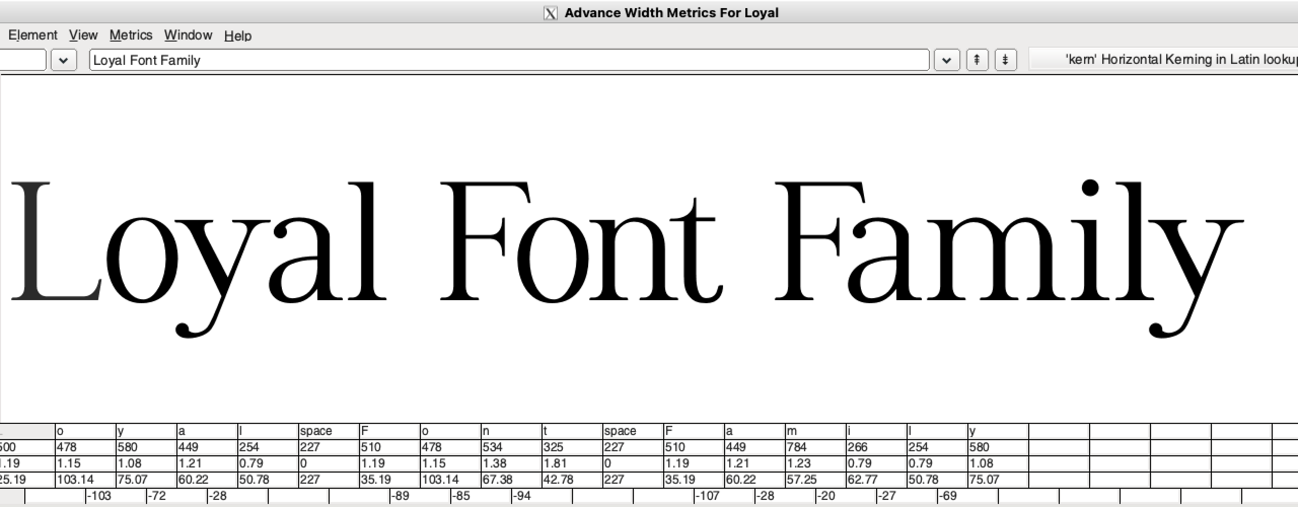
Refine, refine, refine. More context helps with finding every possible error and discrepancy.

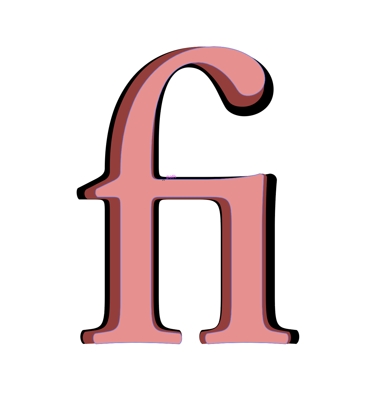
Type design softwares have the ability to create heavier or lighter weights with the click of a button; while this tool is useful, it introduces a new host of issues that need refining. Here’s an example of using that system on a Garamond ‘fi’.
With multiple weights to play with, I could experiment with how the contrast compared with other typefaces. Here’s an example of Loyal (top) compared with Garamond (bottom). Specimens >
